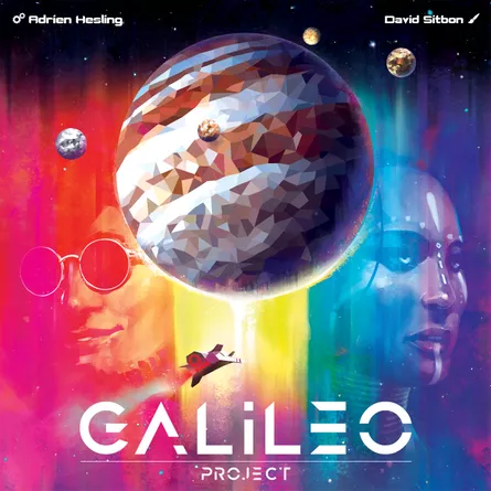
Embark on an interstellar journey with Galileo Project, a captivating space-themed board game that seamlessly balances strategy and simplicity. Immerse yourself in a world of stunning artwork and premium components that elevate your gaming experience. While there are a few minor gripes, Galileo Project offers a delightful cosmic adventure, leaving you yearning for just a few more turns to accomplish your cosmic goals.
In Galileo Project, players struggle with the time and all the possibilities in the game for scoring. The game often ends with you wanting more. However, after a few games players begin to better manage the “short” amount of time, knowing what can and can’t be accomplished.
The decision space in this game feels very good. There are high strategic options but also a very simple turn structure. Players often have to decide between upgrading or snatching points. Towards the conclusion of the game players are going for easy points. However the game often ends without fully reaching players ambitious plans.
Disclaimer: This product was received for free. This post also contains affiliate links. This means I may earn a commission should you chose make a purchase or sign up for a program using my link. Thank you for supporting the website!

Gameplay
The core gameplay loop is simple: each turn, players must choose between 1 of 3 options.
1. Purchasing a robot
2. Hiring a character
3. Buying tech.
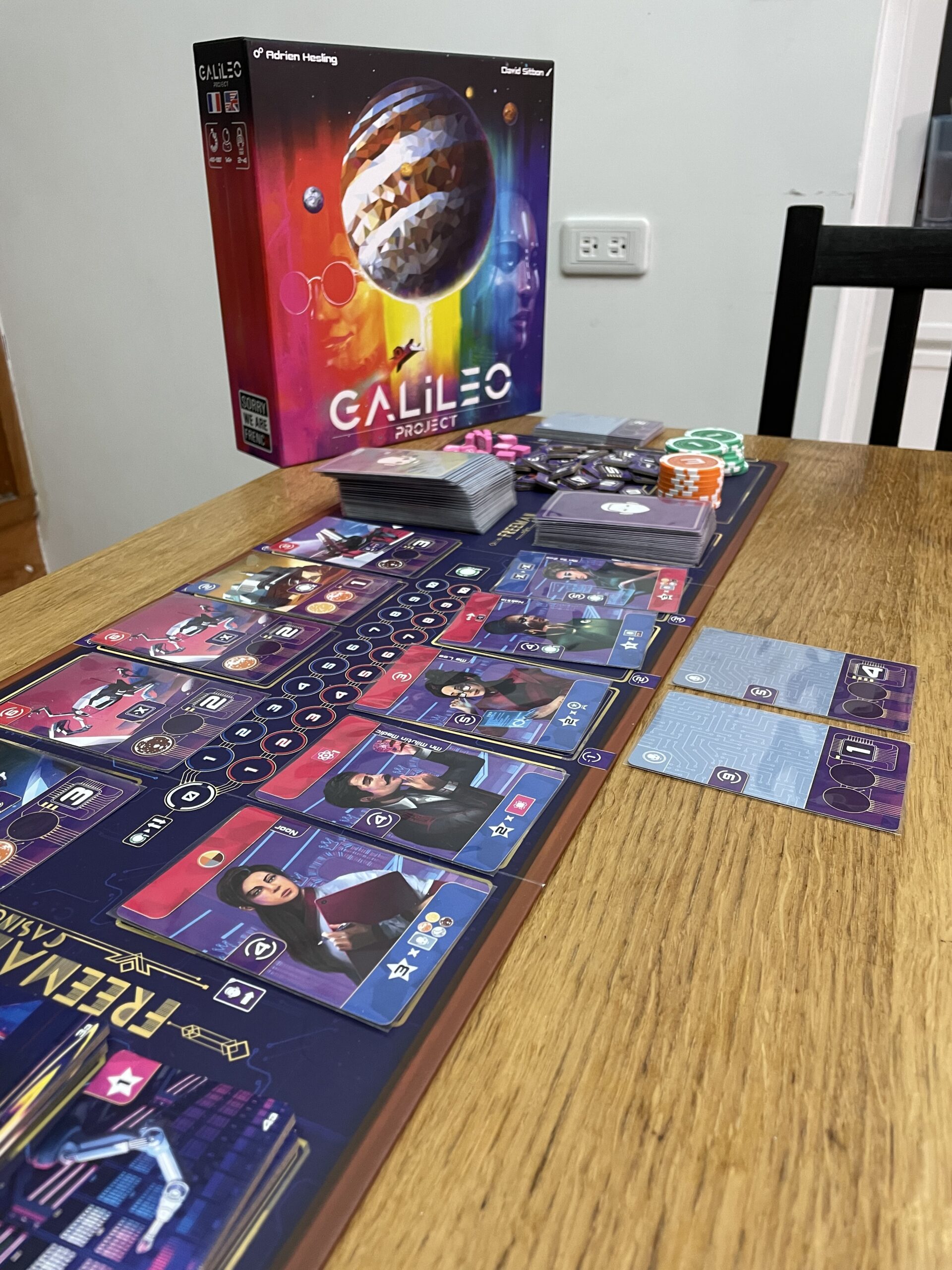
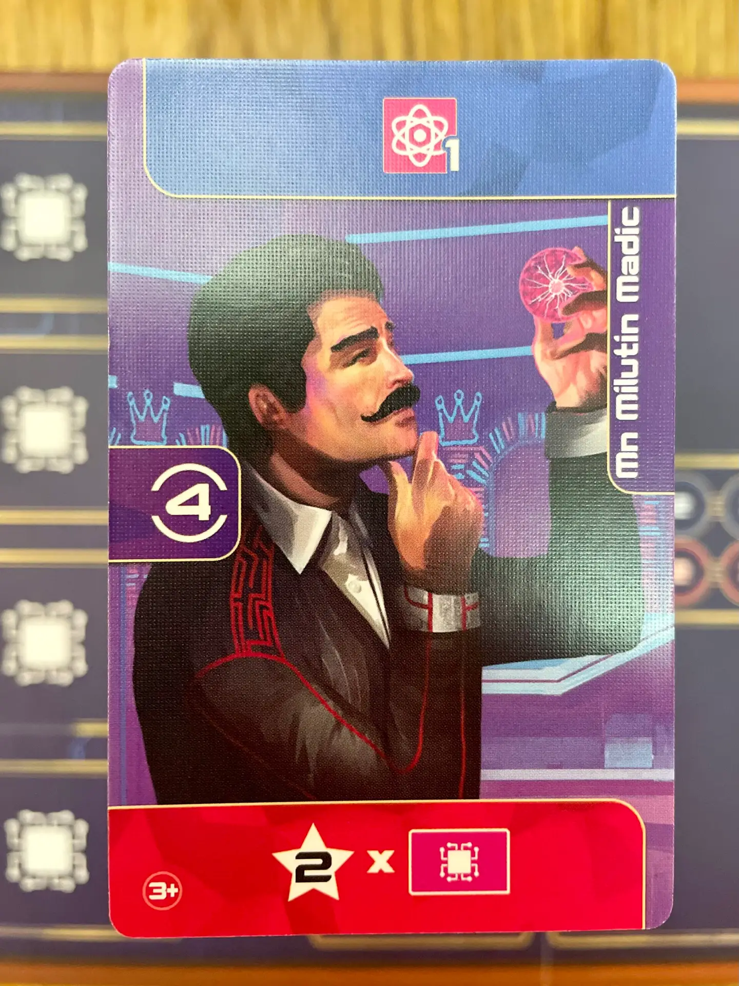
Characters is the main way players gain resources. The card almost always gives influence for purchasing robots in later turns. It also gives you the option between tucking for end game points or some kind of reward. But players must choose how the card is used, forgoing other reward. Players hire these sketchy characters from the Casino. If you ask me, that’s not where you want to find good employees.
Players hire sketchy characters from the Casino.

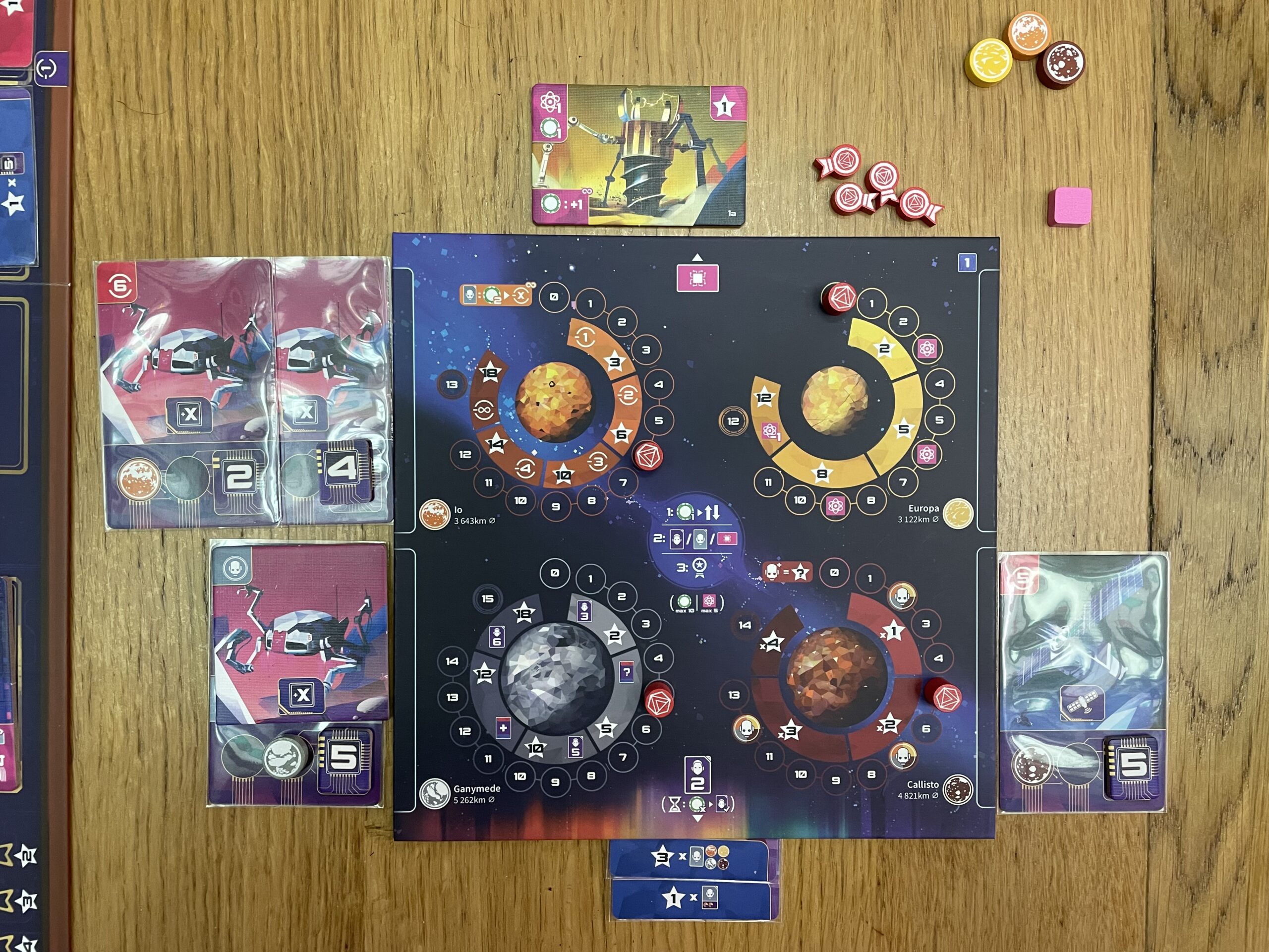
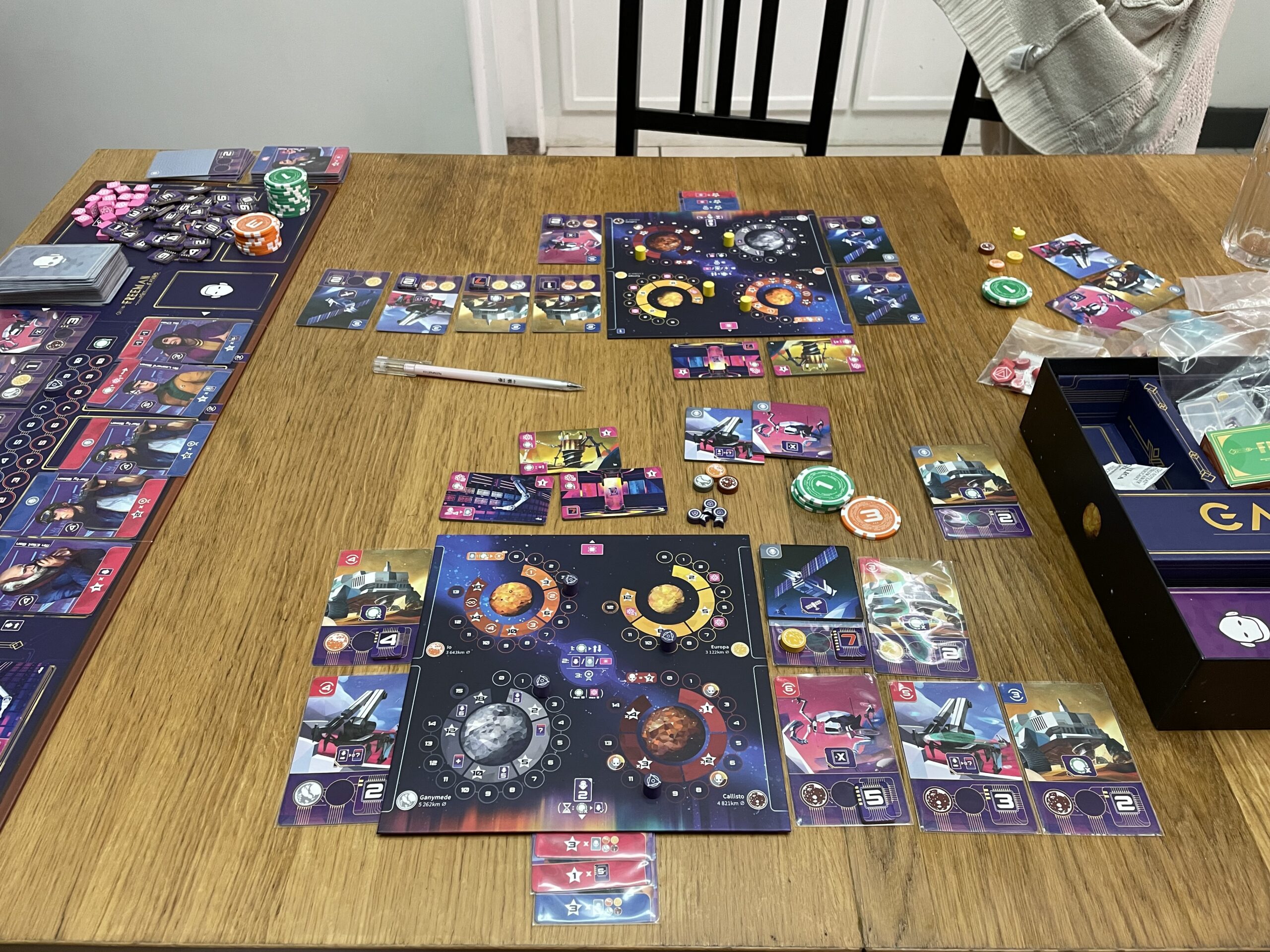
Robots are played on one of four of Jupiter’s main Moon’s. This enhances players’ game engines and earns more points for end game scoring. One of the most unique things about Galileo Project is that the Robots can be reassigned to other planets causing players to seemingly “backtrack” but actually gives amazing benefits since players can regain bonuses again upon adding new robots or later returning other Robots back to previous planets. This can allow for some mild combos to happen allowing for very satisfying turns.
Tech upgrades allows players to get special one-time bonuses or recurring bonuses depending on the tech selection. Depending on what goals and strategy players have developed can make tech extremely useful early on in the game. However the resources (Energy and Mega-credits) isn’t always easy to come by.
Goals can be claimed by players at the end of a turn. Goals can earn players extra points but can be hard to obtain with the requirements needed. Galileo Project actually allows players to spend Energy to decrease the goal requirements. For example if a player needs to have 10 Mega-credits, they can spend 1 or more energy to decrease the requirement by 1 each! This means that if an opponent is close to a goal players can sneak in to claim it for the higher point slot! However only one goal can be claimed a turn so be sure to not miss any opportunities to score before your opponents do.
Estimating a player’s overall position in the game can be challenging, as there’s no in-game point tracker to gauge score progress. However, Galileo Project thrives as a mostly solitary experience, with a few moments of racing to get cards or goals before another player. It definitely doesn’t feel like players are just comparing scores at the end, there is some drafting interaction and goal racing that happens in the game. A big part of the game is knowing if players should drain the character pile to end the game more quickly or delay the game for more points.
2-Player Issues
Robot Card Cycling Issue
Overall the game plays well at 2-players. However, the biggest problem is when a situation comes up when no players want to take the robot cards available. There is no refresh or recycle mechanic besides purely having to buy a card you don’t want to get other cards to show up. In a 3 or 4 player game this hasn’t been an issue. I still enjoy this game at 2-players and play most of my games at this player count.
The game does scale the Character deck(main game timer) for player count. This helps keep the game play time more consistent and card selection better at different counts (this doesn’t apply to the Robot Deck).
Set-Up
Initial game setup and rule learning require around an hour, but subsequent setups become much quicker.
During set up the most time will be spent on shuffling two separate decks of cards (robot and character cards) and dumping three bags of tiles right onto the designated spot on the board.
Overall the set up shouldn’t take more than 5-10 min.
Playtime
Galileo Project cleverly employs a built-in timer mechanism. The game progresses as the character deck depletes or when ten robot cards are played by a single player. Most turns, players either draw a character card or play a robot card, causing the game to have a consistent pace. Initially, it might feel too fast, as players will wish for more turns to accomplish their space mining fantasies. However, after a few plays, players will adapt and plan for better, being more aware of the time limitations.
Galileo Project cleverly employs a built-in timer mechanism.
General Design

Components
The components of the game are all very good quality with an added touch of luxury with poker chips.

Only wooden pieces were used for all main moving bits. While all the goal tiles, tech tiles, and robot level are thick premium cardboard pieces.
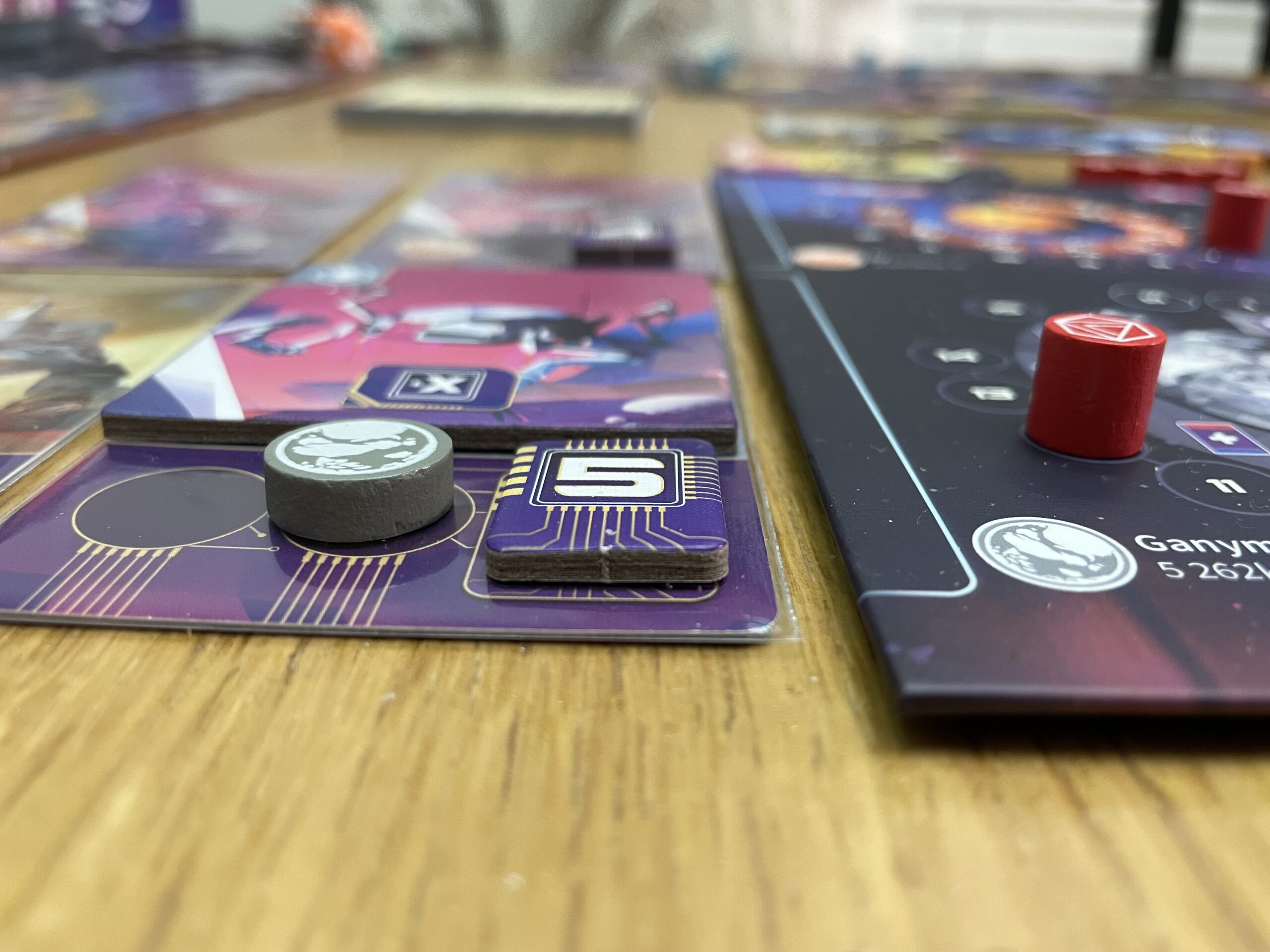
The main board and player boards have are high quality with a glossy finish. I do wish the player boards were double layered as it is easy to bump your board from constantly moving robot cards and tucking cards under the bottom of the board, which may cause pieces to shift. However it is very very easy to reset it into place as the total level of the robots at each moon will indicate where your pieces should be.
One simple upgrade to the player board is a technique found in Stonemaier’s Expeditions using little bumpers that permanently stick to the bottom of the board to give it a slight lift to easily tuck cards underneath the mat. They were not included in this game like Expeditions did but they are generally cheap and easy to find in office supply or craft stores.
Art and Visual Clarity
The main game board is very nice and easy to read. Everything has a clear place where it should be. The art design adds to the game without being distracting. I personally found the character art to be a uninspiring and boring. When playing the game I was never using the name of the card so much as focusing on the icons to name the card. “I want the +1 Energy Character.” vs “I want Min.”

The Robot card backs gave off a major bald dude vibe.
Colors
My biggest complaint about the game is the color scheme for some icons and pieces. The game has two influence tracks, blue (earth) and red (mars). However, two of the four player colors are also red and blue! The other two being purple and yellow. Our first game we played as red and blue. So many times we accidentally associated which influence track we were on based on our player color instead of the color of the influence track. The game has you constantly evaluating what you are going to do based on the influence track (red and blue) with the corresponding robot & character card colors (red and blue), plus having to evaluate your moons and other things. To finally decide what you wanted to do and to realize you were thinking about the wrong influence track can be very frustrating causing you to have to rethink your whole turn. They could have easily used other colors to avoid this simple mistake.

The other issue is the Tech (Image: bottom icon) and Energy (Image Top icon) both have clearly different logos, however the logos are both pink. It’s very easy to accidentally quickly read something wrong (especially the first couple games) just because the pink color is being used to represent both things. I wish they made the tech green like a motherboard or the energy yellow.
My biggest complaint about the game is the color scheme for some icons and pieces.
Iconography
The iconography in this game is amazing. Upon the first play-through players will be having to check the icons’ meanings fairly often. However once the game has been played 2-3 times the icons become very intuitive. There is literally no text in this game for game play use. There is card titles but that isn’t necessary for understanding the card mechanics. After the first play through need to check the rule book is rare.
Language Dependency
There is no text on any of the components for the purposes of game-play. This is one of the the heaviest games I’ve played that is 100% language independent. See Iconography for more details.
The Box
Box Insert
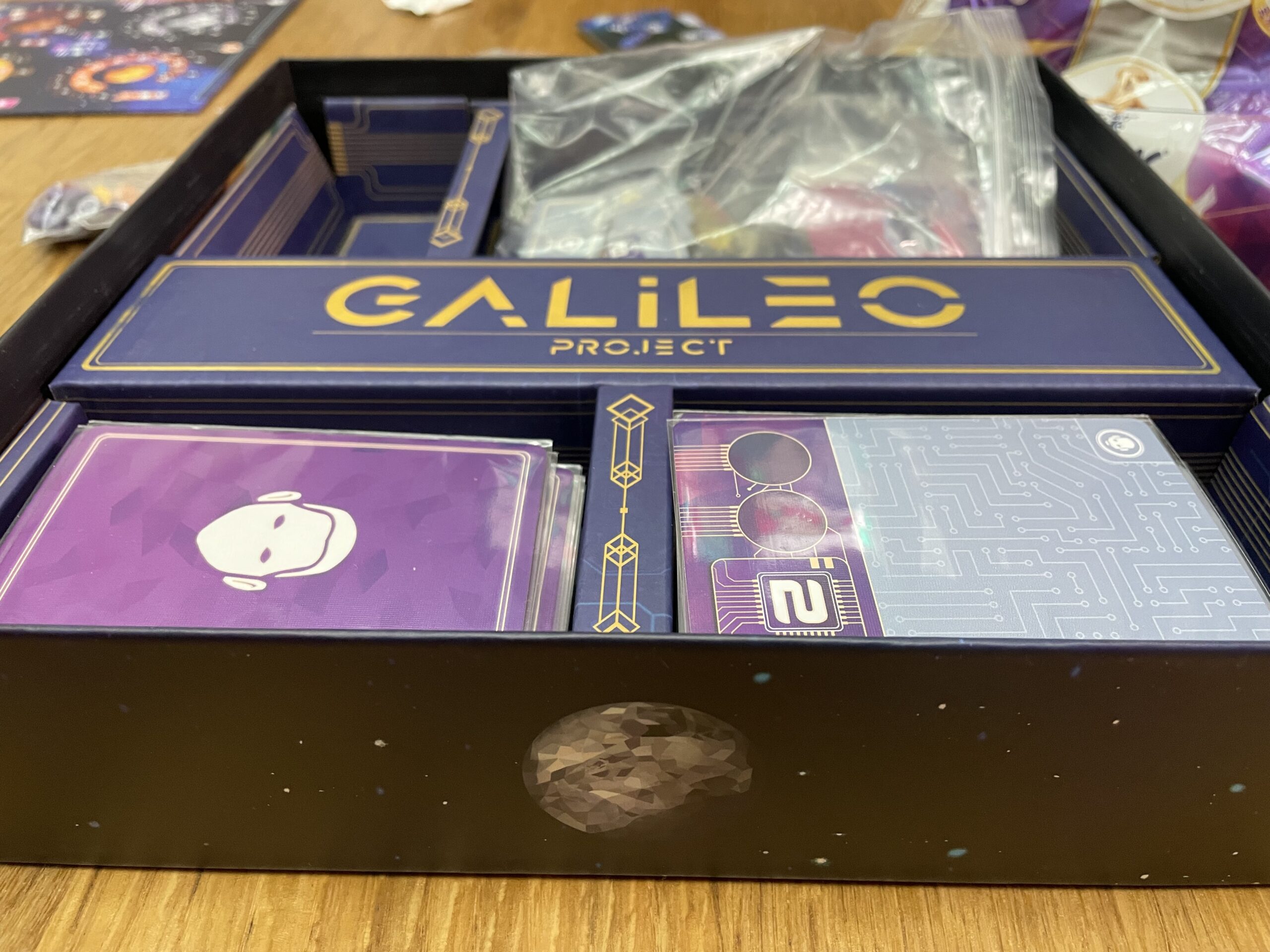
The game box is basically 4 divided pits. Two of which are for the cards, one is solely for the poker chips and the last pit is for everything else. I can’t quite get all the bits and pieces that are stored together to fit very well. It’s a little bumpy and not as flat as I wish I could get it without a lot of Tetris puzzling the pieces together. It’s not the worst case scenario but it does cause a bit of box lift.

Sleeving
I was able to sleeve all the cards with premium standard sized sleeves (Sleeve King) and have it still fit in the box. This is a huge plus for me and everyone who sleeves cards!
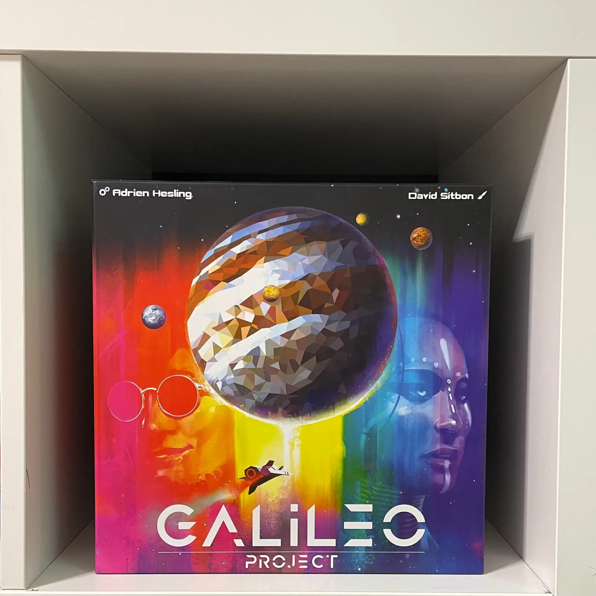
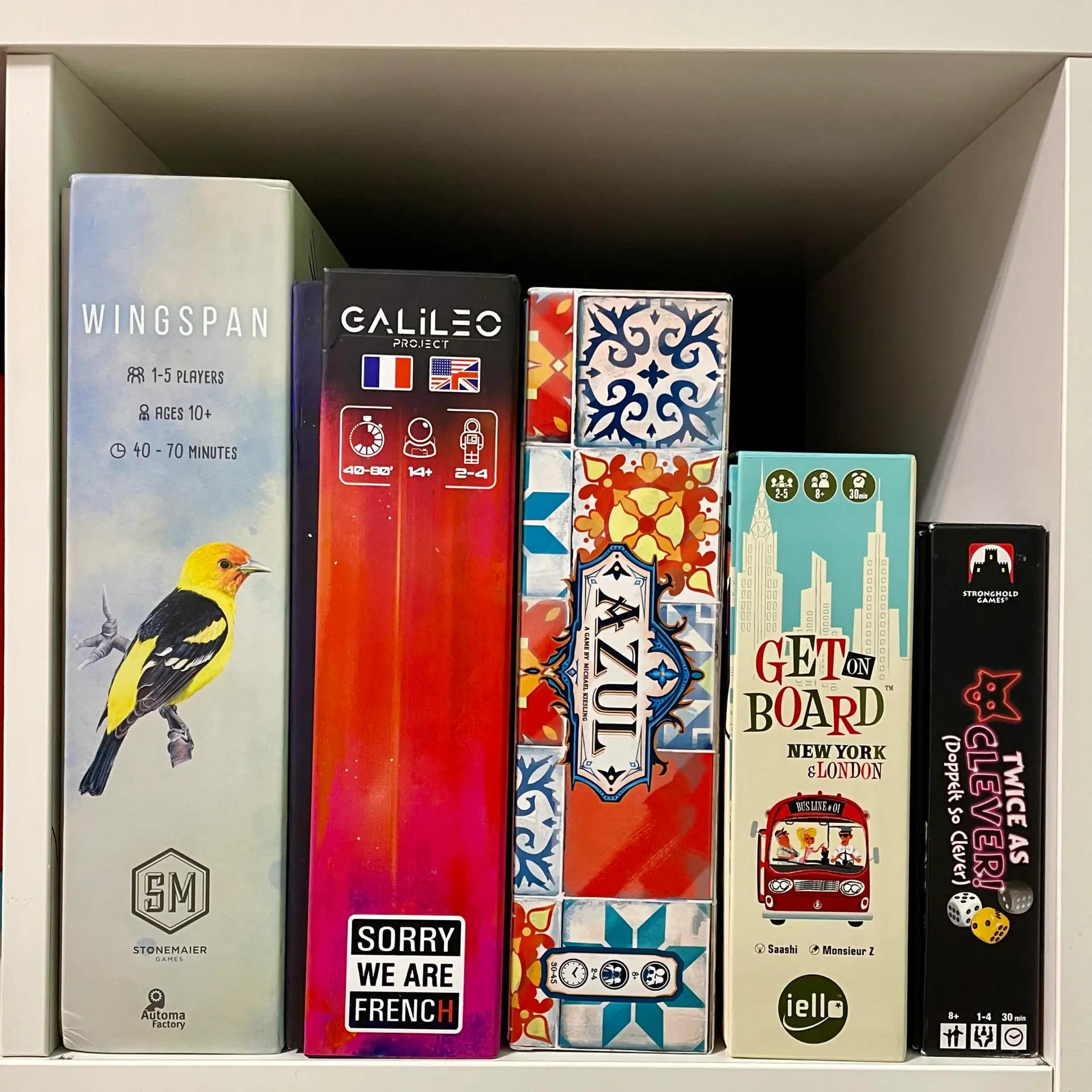
Does it Fit on a Kallax?

Rule Clarity
- Moving the Development Marker backwards does not grant rewards (ie energy or robot upgrades) But rewards can be received again when moving the marker forward in later turns. This common mistake is due to the English translation being unclear with its wording.
Rule Book Phrasing
“Development markers may sometimes move backwards. Upon moving your Development marker back onto or past space “3”, “6” or “9”, you gain 1 Energy again.”
This initially sounds like you receive energy upon moving the Development marker backwards. However as Peter Evensen pointed out on the BGG forums, in the original French “et qu’en le faisant progresser de nouveau, il atteint ou dépasse la cas…“ makes it clear that you only gain the energy when you advance a second time onto or past the space (when going forward), not when you backup to or pass it going backwards. Thanks to Peter Evensen.
Final Verdict
In conclusion, “Galileo Project” offers a thrilling and immersive space-themed board game experience that balances accessibility with strategic depth. While it has its share of minor issues, such as color confusion and occasional rule ambiguities, the game’s premium components, captivating artwork, and rich decision space make it a compelling choice for those who enjoy engine building and space themed games. This is one of our favorite games published in 2022.
Similar Board Games
Astronomy theme: The Search for Planet X
Light Engine building with card drafting: Evergreen
Card tucking upgrades and point chains-: Expeditions


